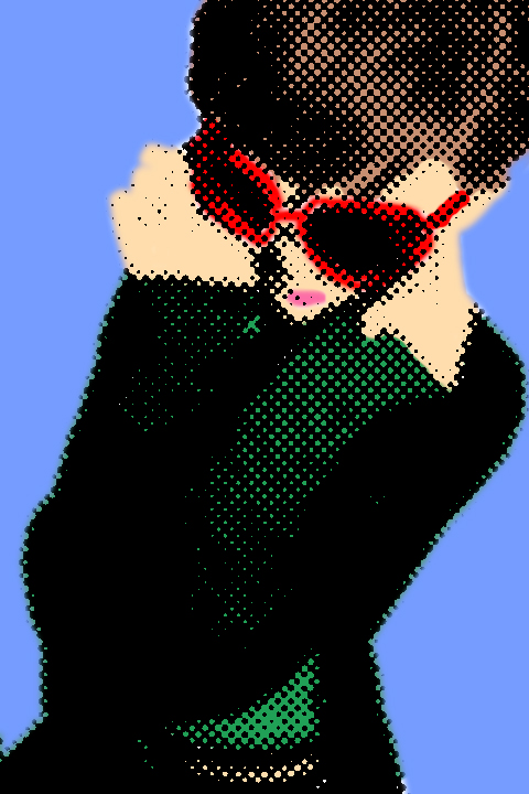
As my magazine title is Beehive which to the audience represents the sixties, I wanted to experiment with pop art and dot art. Pop art in an art movement that originated in Britain in the mid-50’s. Although Pop Art began in the late 1950s in the USA, Pop Art in America was given its greatest impetus during the 1960s. By this time, American advertising had adopted many elements and inflections of modern art and functioned at a very sophisticated level. Consequently, American artists had to search deeper for dramatic styles that would distance art from the well-designed and clever commercial materials. As the British viewed American popular culture imagery from a somewhat removed perspective, their views were often instilled with romantic, sentimental and humorous overtones. By contrast, American artists being bombarded daily with the diversity of mass produced imagery, produced work that was generally more bold and aggressive. However much like Roy Lichtenstein, I decided to work with dots instead.