Thursday, 12 January 2012

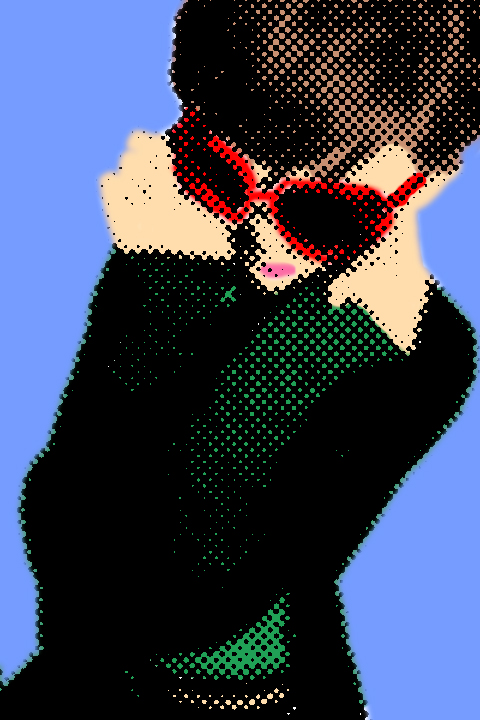
PopArt / DotArt. :)


As my magazine title is Beehive which to the audience represents the sixties, I wanted to experiment with pop art and dot art. Pop art in an art movement that originated in Britain in the mid-50’s. Although Pop Art began in the late 1950s in the USA, Pop Art in America was given its greatest impetus during the 1960s. By this time, American advertising had adopted many elements and inflections of modern art and functioned at a very sophisticated level. Consequently, American artists had to search deeper for dramatic styles that would distance art from the well-designed and clever commercial materials. As the British viewed American popular culture imagery from a somewhat removed perspective, their views were often instilled with romantic, sentimental and humorous overtones. By contrast, American artists being bombarded daily with the diversity of mass produced imagery, produced work that was generally more bold and aggressive. However much like Roy Lichtenstein, I decided to work with dots instead.

Monday, 9 January 2012

Playing with the Contents page. :)

I decided to play around with hoe my contents page will look. So far it looks very cartoonlike and unprofessional:
However later on I hope, to make look more professional with a glossy feel.

Wednesday, 4 January 2012

Fonts. :)

Choosing which fonts to use was a very difficult task as there were some many to choose from so I decided to choose a few fonts at random and test them out. I then chose my four favourite fonts and wrote them out in the colours I wished to use in magazine, in both capitals and non-capital letters.

Monday, 2 January 2012

Playing with fonts. :)


I chose to use Accent SF in my first trial, adding various effects such as drop shadowing, embossing and outer glow. I don't think I will be using this font as it does not look professional enough to accompany my photoshoot

Friday, 9 December 2011

Taking my images. :)

After my photoshoot, we took a trip to Britain and Ireland's Next Top Model Live. Where Amy Childs from The Only Way Is Essex was promoting her fashion line. I then chose to use the pictures it took whilst there, to add to my contents page.

There was also interviews happening at the same time, one of which was with Harry also from The Only Way Is Essex. I took a picture of this aswell:


Billboard, Front Cover, Contents and Double Page Analysis :)

  • The use of popular young artists, shows the target audience to be those between 15-25.
  • Billboard magazine is aimed at those who are particularly intersted in the featured artist. This maybe the reason they use very little other information other than that concerning a particular featured artist.
  • However, The small use of artists from various different musical backgrounds such as Taylor Swift, Eminem, Sting and Sheryl Crow, draw in a wider audience.
  • The use of the colour pink Pink symbolizes love and romance, caring, tenderness, acceptance and calm. It also gives out an up-beat, lively feel which fits with the genre of music Katy Perry produces.
  • The plain background Katy Perry herself stand out. Not only this but the black writing "Katy Perry" stands out against the plain, pink background. Which helps draw in the target audiences attention.
  • The flowers surronding Katy Perry draws in a more girlie audience, which to me suggests that the target audience would be females 15-25.
  • The flowers also give the impression that Katy Perry is herself a girlie girls.


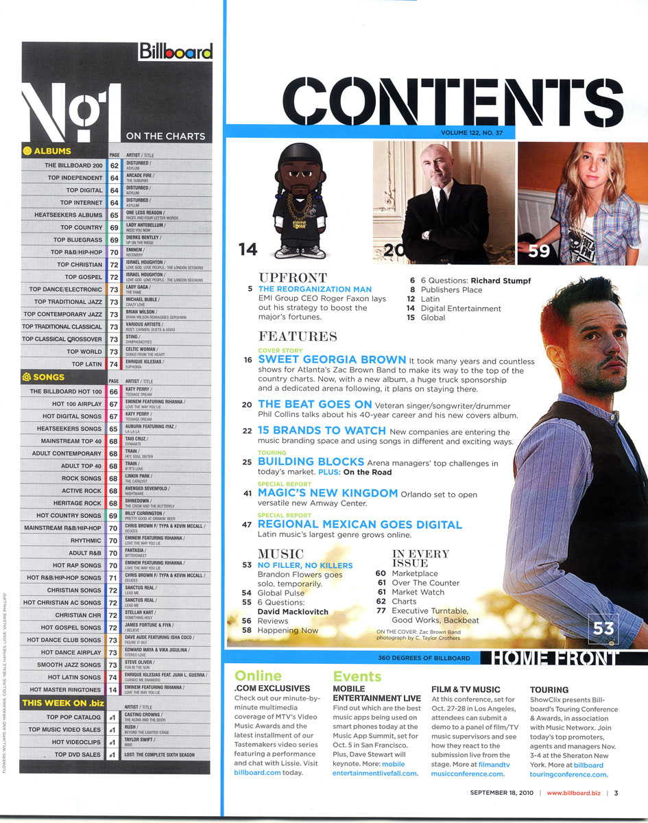
  • The colour is simple but unlike the other music magazines I have analysed it is not the same colour scheme as on the front cover. However the colour scheme of the contents page is the same in every issue.
  •  On the left hand side of the page there is a contents list devoted entirely t music and usic downloads. (Albums, Songs and This week) This layout makes the contents easier to read and follow.
  • There is then a divide down the page to seperate the regular content from the features in the specific issue.
  • On the other side of the divide are images of the featured articles, unconventionally there is no information just a page number, this would help draw in the audience as they would be eager to see what the articles are about.
  • This side of the contents page is also split into setions, up-front, features, music and in every issue. This again makes it easier for the audienceto read.
  •